
“Big data” is a term that basically means a large amount of data and it has been used more frequently in the past decade. Big data has forced companies to adapt by implementing platforms to store massive amounts of data and tools to manipulate and interpret these datasets to understand what the data is saying. Data visualization is the use of visuals such as graphs and charts to display key bits of data that are found in these massive datasets. It provides a quick and easier way for someone to understand data through the use of visuals rather than going through the database row by row, or reading through loads of text. The purpose of the visuals are to give a snapshot of key aspects of one or more datasets that the creator wants to highlight to an audience, such as senior management, so that they will have the necessary knowledge to make informed decisions regarding their business.
Two common and powerful data visualization software programs are Power BI from Microsoft and Tableau. These programs are able to process large tables of data and summarize them into visuals for simpler comprehension. There are multiple visuals to choose from, and which one is used is dependent on the user and the type of data. Some of the most common visuals include bar graphs, pie/donut charts, line graphs, gant charts, treemaps, geographic maps, and many more. Several visuals can be combined into what is called a dashboard so that together, they tell a more fulsome and holistic story about the datasets. Here is an example of a dashboard created in Power BI.
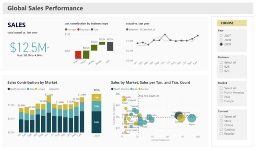
Screenshot taken from Light Dot Lab. Click the link to play with this interactive dashboard.
https://www.lightdotlab.com/power-bi-3-visualisation-sharing-training-course
The above is a dashboard showing key figures on the sales of a company. It displays total sales per year and breaks sales down by business type, sales by market, sales by transaction and can compare sales from last year as well. With data visualization, you are able to dive in and review data from different perspectives with just a few clicks. It gives a means for the user to explore the data and uncover insights by discovering patterns, trends and identifying outliers.
One of the biggest advantages of creating dashboards is their interactivity. Interactive dashboards allow users to see different scenarios efficiently. In the example dashboard from above, the user can see sales from different years in different markets by clicking on the menu on the right to easily compare different sets of data. The visuals change instantly according to what is selected on the menu as the software manipulates data in the back end. However, not all data visualizations are interactive; they can also be static yet still provide the same information, or they can serve another purpose. Reports that display performance over a specific period are the most common static visualizations. These visuals are typically found in weekly, monthly, or quarterly reports for management or clients as a value-added service. Infographics are also one of the most common examples of a static visualization. They can be included in Powerpoint presentations as well-designed visualizations that can tell a compelling story and are engaging for audiences. There are some amazing examples of dashboards and infographics on the Tableau Public Viz Gallery where the community members post visualizations they have created. Here is the link to the gallery: https://public.tableau.com/en-gb/gallery/?tab=viz-of-the-day&type=viz-of-the-day.
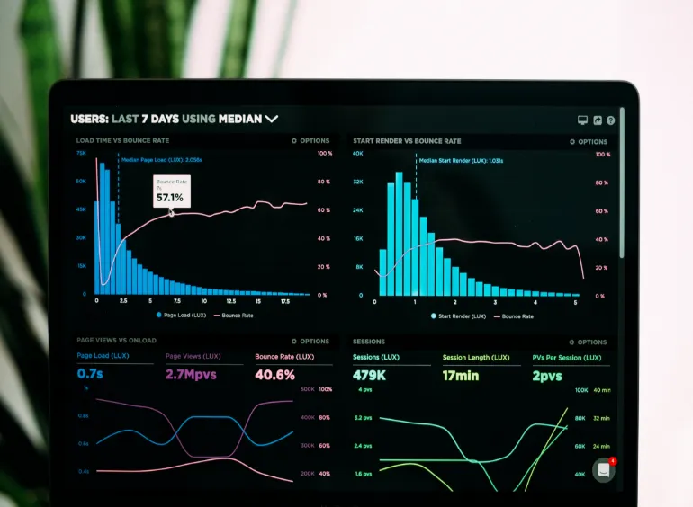
In the mobile space, dashboards are great for monitoring live data because the visuals are updated as data comes in. They can track app downloads by the second as data is pushed from the system into your dashboard, or other metrics such as clicks, views of a website, etc. As long as the data is set up to be tracked from the app itself, it can be retrieved and visualized. Data can also be retrieved from third parties such as MMPs if they have a push or pull API set up. Tracking live data allows you to make decisions on the fly based on the latest information which could be a huge advantage especially if time is a factor.
Another advantage of using data visualization software is that the dashboards can be viewed and used by multiple users. Dashboards can be created to serve multiple teams so that everyone can access the same data efficiently and from any computer. However, sharing and creating dashboards depends on the plan you have with the provider of the data visualization software. Typically, you would need licenses to create and view dashboards, and if the company has the funds available, a server to publish these dashboards so that they can be accessed from a website. Dashboards can also be shared with people outside of the organization which could provide some excellent value if you’re providing services to users outside your company.
Even though different teams can view dashboards, they should not be built in a one size fits all kind of way where everything is put into one dashboard to serve everyone. It is important for the creator of the dashboard to meet with the stakeholders before creating it to determine the needs of the users. In addition, dashboards shouldn’t be too complex because multiple connections to several databases can slow down the performance of the dashboard and negatively impact efficiency.

Data visualization is a powerful tool that enables readers to digest data quicker and easier. Tools such as Power BI and Tableau are used to create dashboards that enable us to identify patterns, trends, and outliers and present them in an aesthetically pleasing manner that is easier for viewers to understand. These insights would lead to more informed decisions which would have a positive impact on business. As data has become increasingly important to business, more and more companies are using these programs to make use of their data. Big data is only going to get bigger and therefore, it is critical that we have the tools to interpret and understand it in order to succeed.
February 9th, 2021
Online Advertising Executed with Precision
Contact UsPublicidad Online Ejecutado con Precisión
Contáctanos